FINESSE™
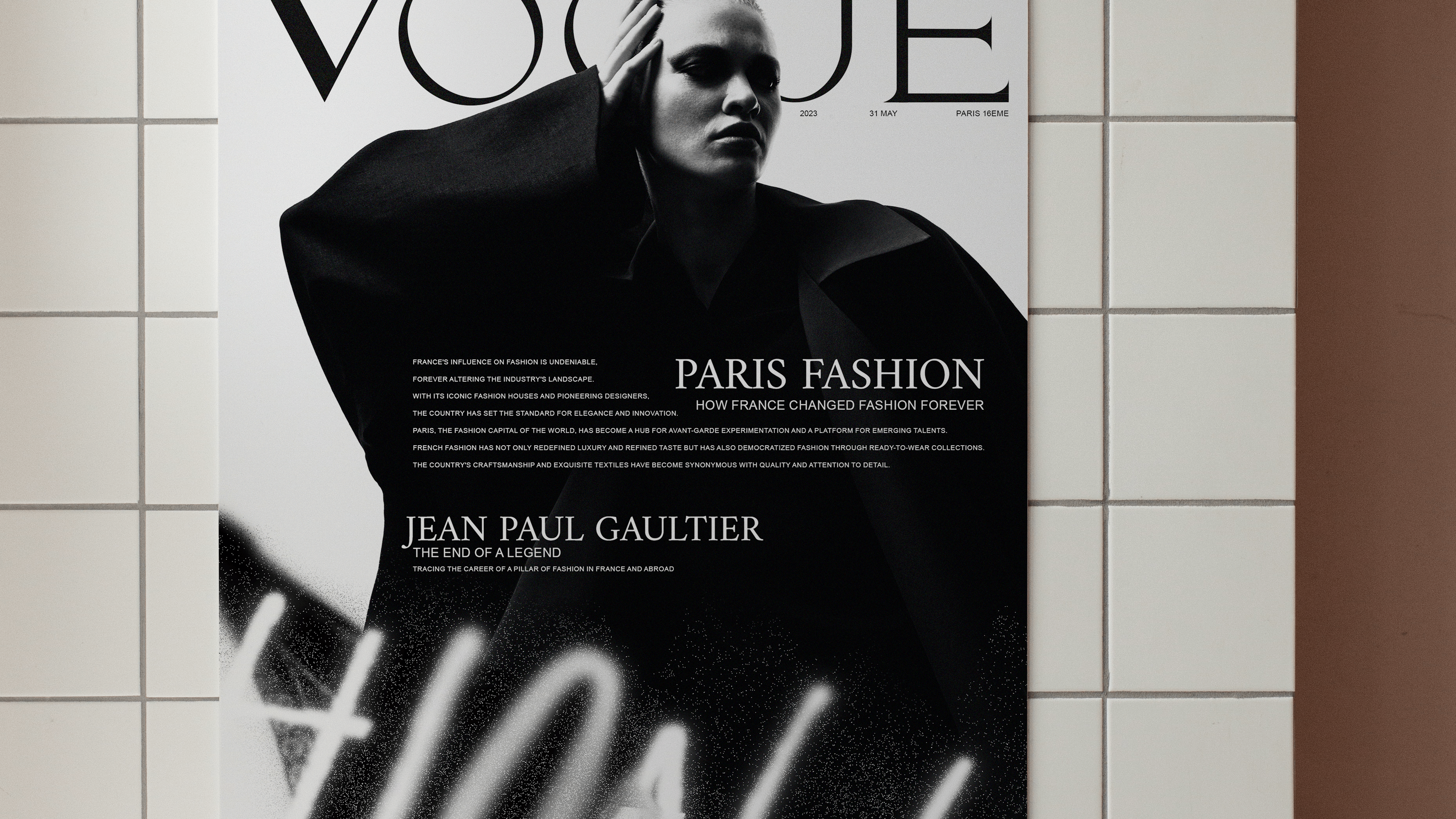
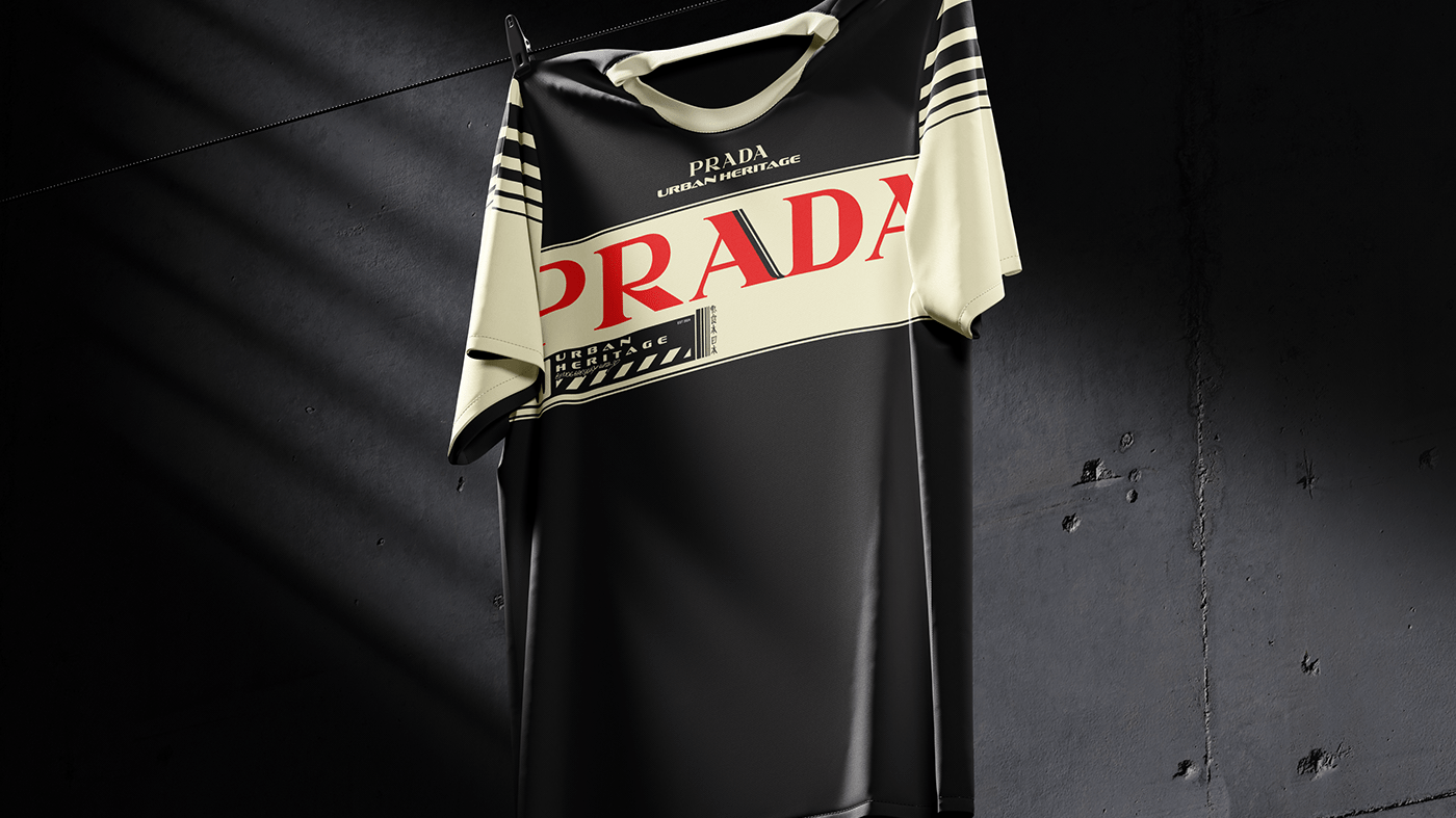
You can think of Finesse as Zara meets Netflix - a new-age fashion house that leverages AI, community feedback and tech to radically change how fashion is created, produced & distributed. We're backed by some of the most well-respected investors and angels who have backed companies such as Uber, AirBnB, Dropbox, Reddit and Twitch.
LOGO
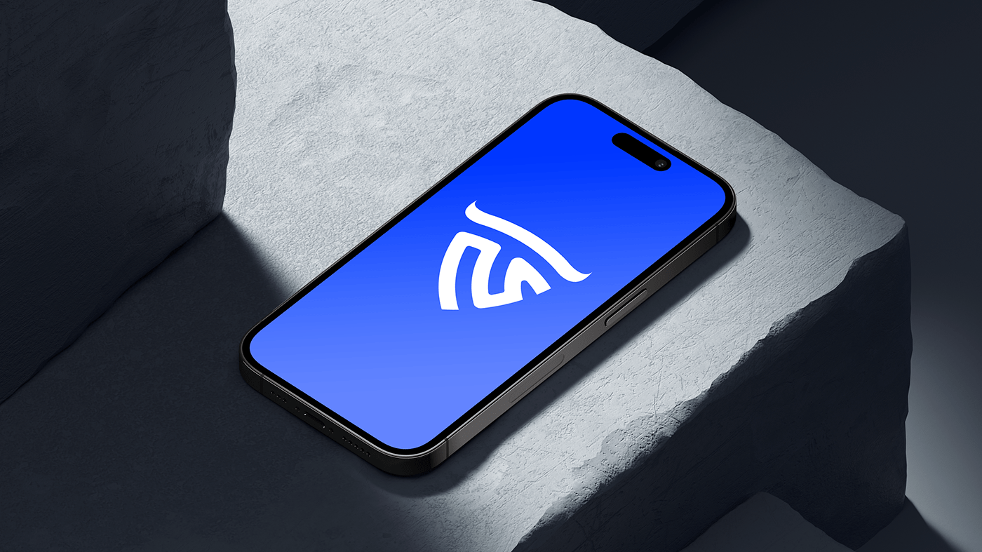
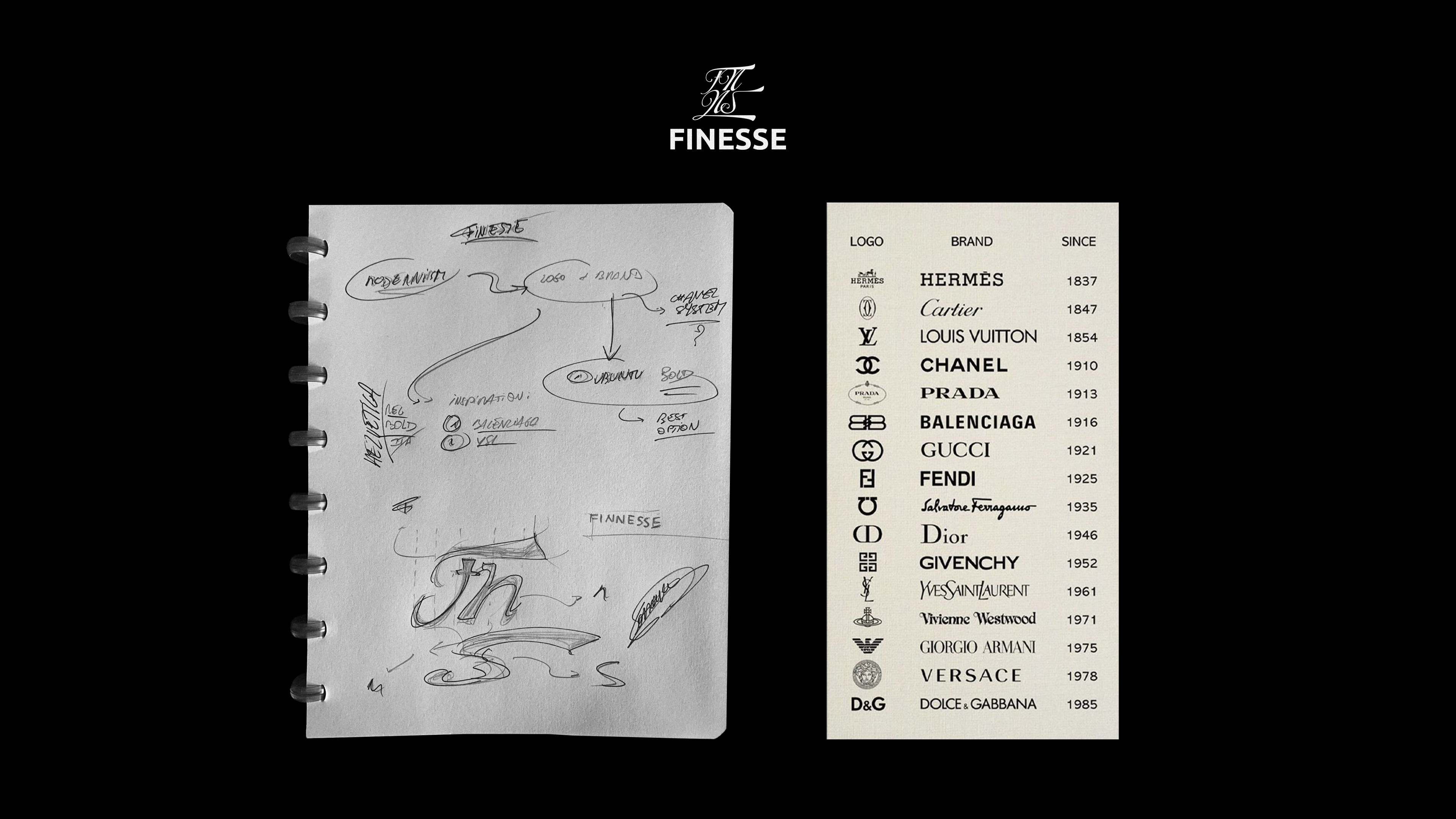
Let's start with the logo, the current logo is relatively complicated to read from afar, it is based on a barcode, which is a technology that has existed since October 20, 1949. The logo must therefore be more readable from afar, especially to be able to be used on small formats such as mobile applications, the logo will also have to have a timeless side.
The current logo also does not allow a great march of maneuver concerning creativity, the barcode is too detailed to be able to make variations. That's why I decided to work on a graphic charter with two elements, a logo and a work mark. This practice is very popular among popular fashion houses like Gucci, Balenciage, Yves Saint Laurent or Versace.
The advantage of these graphic systems is that they allow you to have a creative logo while keeping a very simple and modern word mark that can stand the test of time and make the graphic identity timeless, as you can notice on these examples that date for some from the 19th century.

EXPLANATIONS
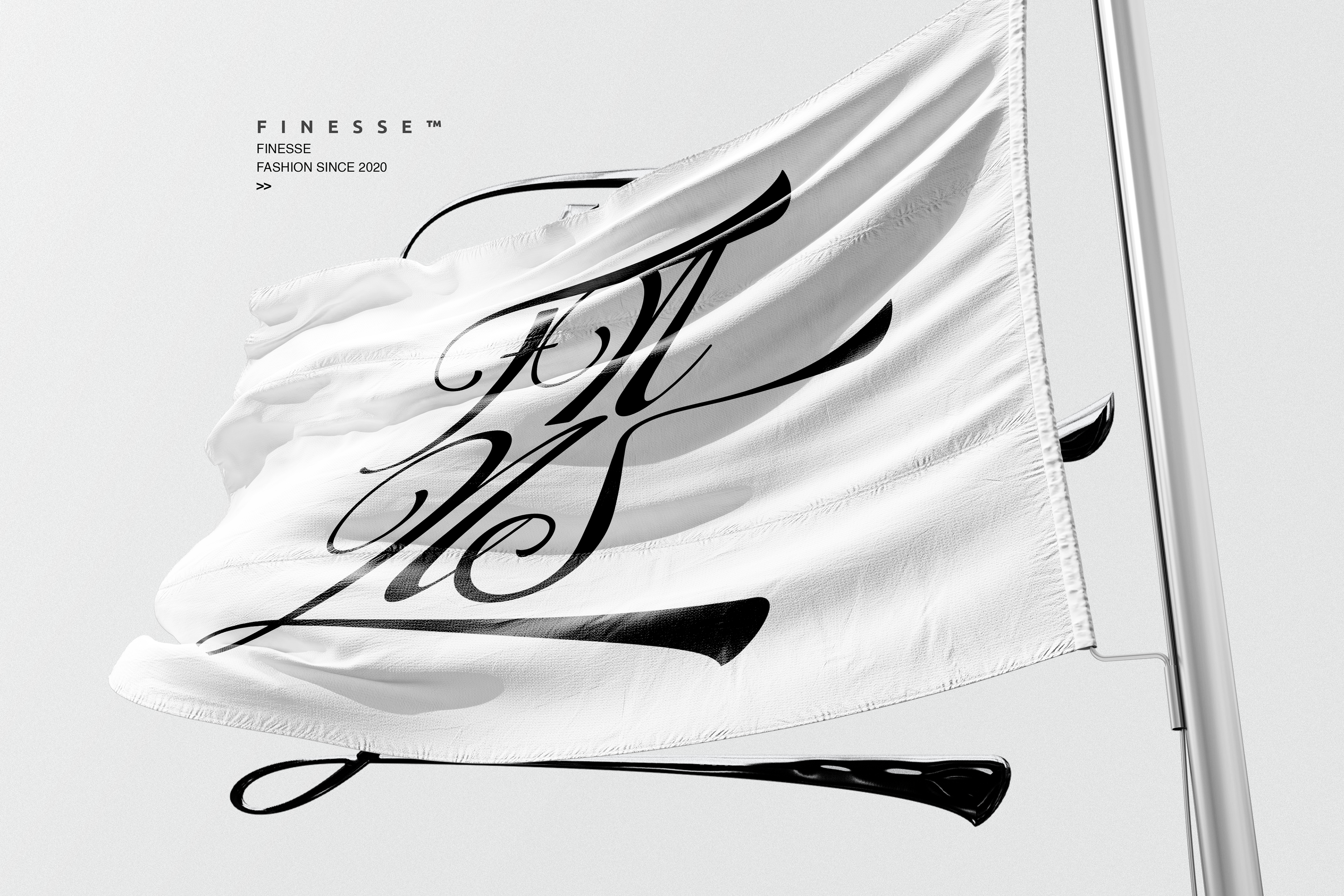
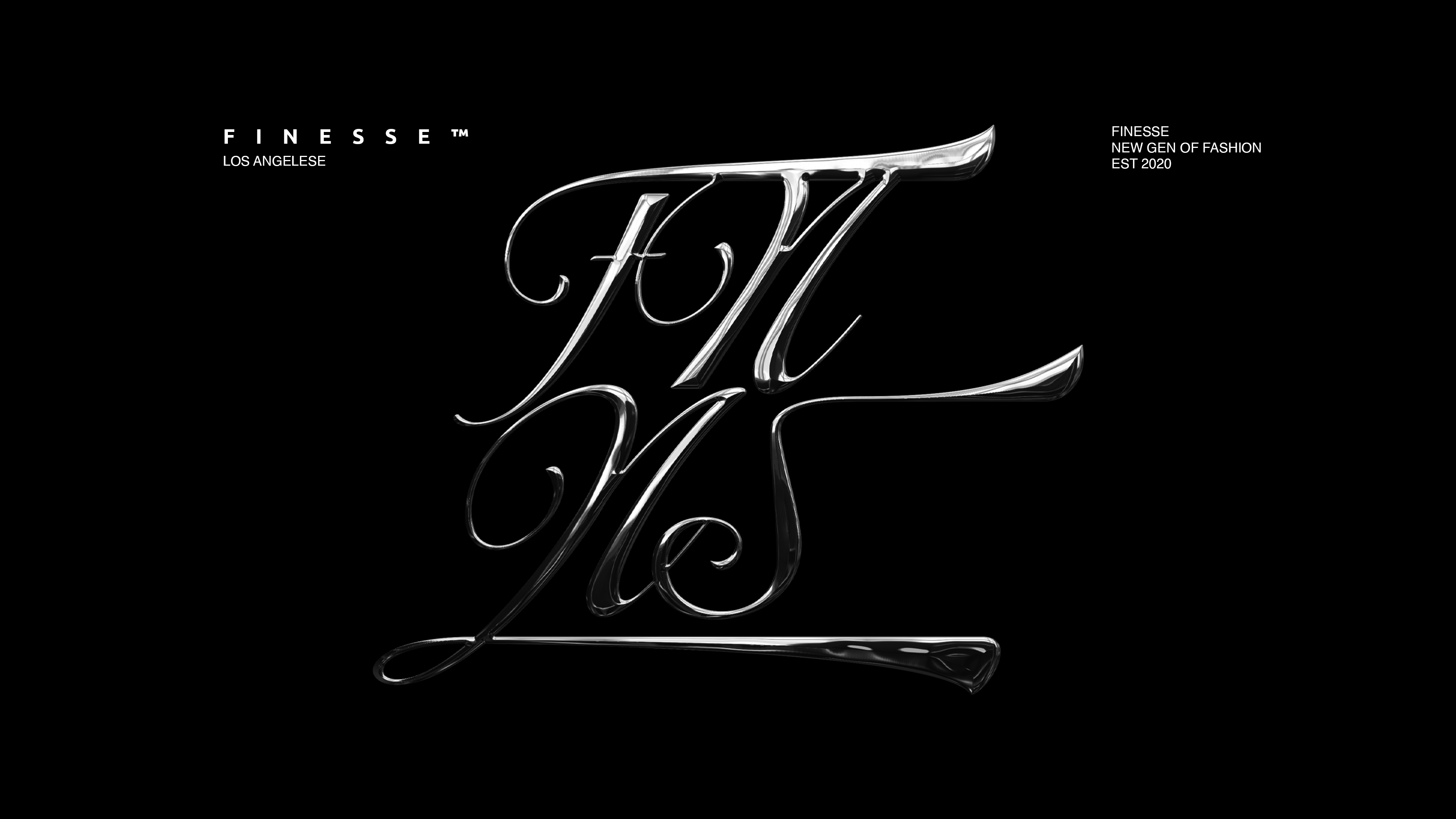
The logo represents the letters FNNS, using only these letters allows to create a more compact and square logo that facilitates its use on labels, packaging or clothing. From a phonetic point of view, reading these letters instinctively deduces the word "Finesse"
The shape of the logo refers directly to the word Finesse which comes from French, which means the quality of what is fine. These delicate and harmonious shapes give an image of luxury and quality to the brand.


INSPIRATIONS
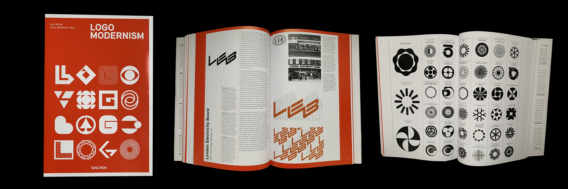
Logo modernism by Jens Muller and Julius Wiedemann

THANKS FOR WATCHING !